
Green Decoded: A Designer's Guide to Color Harmony
Explore the calming power of nature's palette plus tips for choosing the right shades & adding green accents.
Shades of Serenity: Choosing Your Perfect Green Palette
Green isn't a monolith; it's a spectrum, a symphony of shades each with its own unique personality and impact. Understanding these nuances is crucial for creating a space that resonates with your vision.
1. Sage: Whispers of Calm
The Benjamin Moore, Mistletoe, used in a few spots around #Therightfitclient used in these busy walk-through spaces with its muted sagey undertones, evokes a sense of tranquility and sophistication. It's perfect for creating a calming atmosphere in bedrooms or living areas.


2. Emerald: Bold Statements of Sophistication
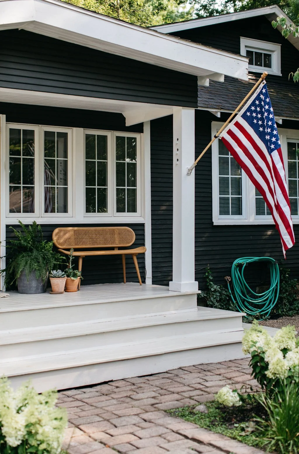
This Benjamin Moore, Deep River, on the exterior of The Leo Cottage, is a rich, jewel-toned blueish-green, that exudes depth and comfort. It's perfect for creating a focal point or adding a touch of a rich grounding feel. (Check it out in person by booking a weekend away!)


3. Olive: Grounded and Earthy
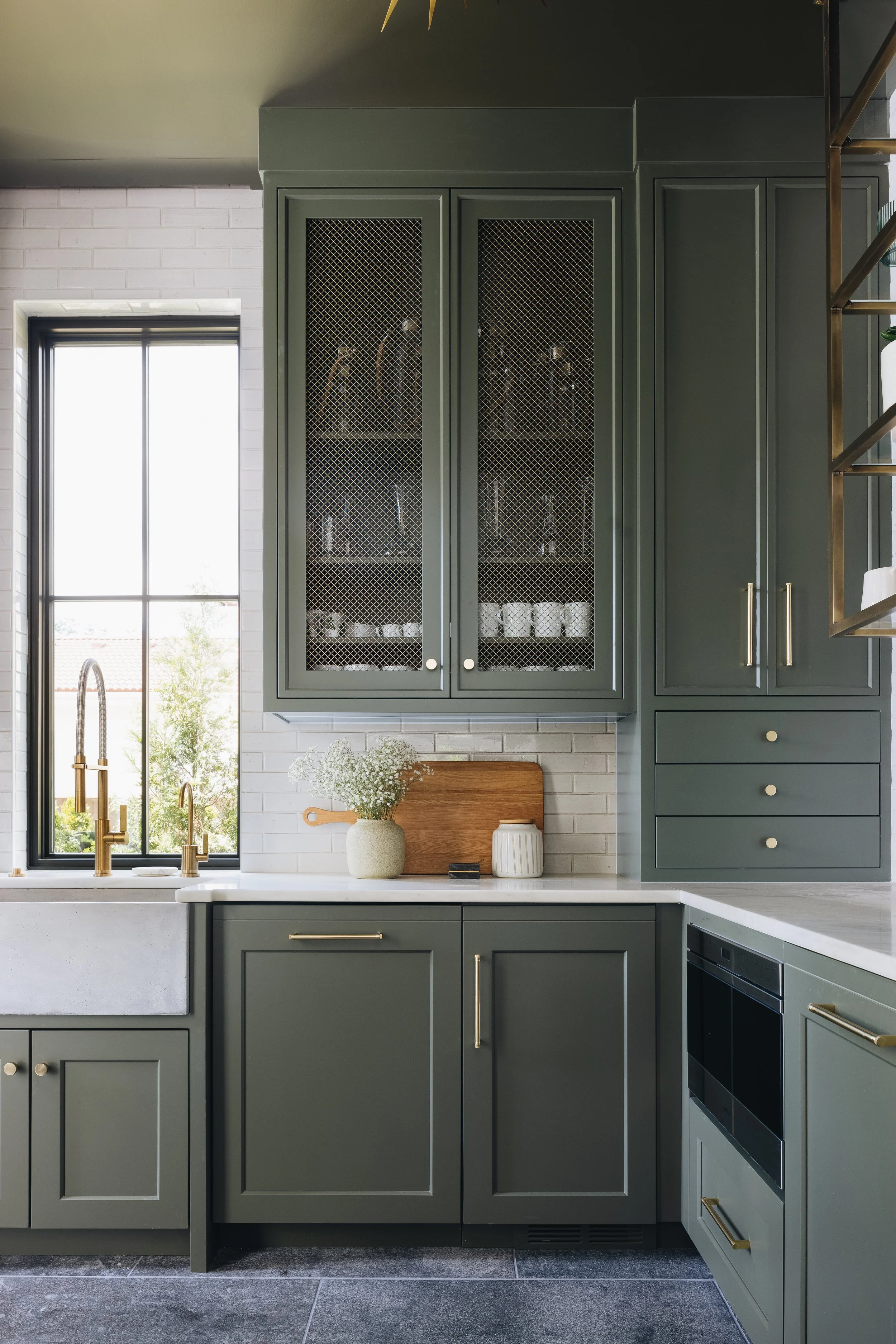
Benjamin Moore’s Dark Olive, was a perfect choice in our #Livingthegreenclient project with its warm, yellow undertones, which brings a sense of grounding and connection to nature. It's a versatile shade that works well in a variety of settings.


Finding Your Perfect Match: Considerations for Choosing Green
Room Size & Lighting:
Discuss how the size of a room and the amount of natural light affect the way a green shade appears.
Personal Style & Desired Mood:
Emphasize the importance of choosing a green that reflects personal style and creates the desired atmosphere.
Color Pairings:
Offer tips on how to pair different shades of green with other colors to create a cohesive look.
That's a wrap for this week's Designer Digest!
Stay tuned for more travel stories, design inspiration, and exclusive content next week!
P.S. Don't forget to follow us on social media for even more design and travel tips to fuel your creativity!